Out of Home campaigns have the power to delight, inspire and activate audiences with compelling creative designs. Digital Out of Home advertising (DOOH) takes this to the next level, engaging audiences through dynamic campaigns that play on contextual relevance and offer a wider range of creative tools to advertisers.
DOOH is so effective that it now makes up more than 60% of overall OOH revenue in the UK. We’re taking a look through some of our favourite DOOH advertising examples that showcase why it’s such a popular choice.

Terrence Higgins Trust: I Test
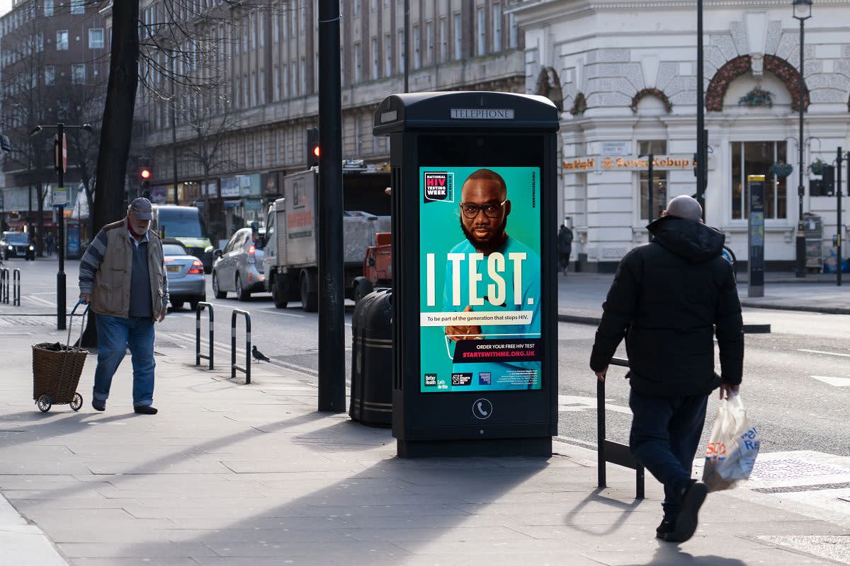
One of the best DOOH campaigns comes from Terrence Higgins Trust. During National HIV Testing Week, the charity advertised across Adshel Live screens in London, encouraging passers-by to get tested for HIV.
The timely campaign took advantage of the elevated awareness and sense of community duty during the appointed week. The copy ‘the generation that stops HIV’ aligns with this objective.
The messaging as a whole is simple but powerful. It includes a hook-based headline, ‘I test’, followed up by a compelling CTA, ‘Order your free HIV test’. The relevant URL is highlighted red to ensure it stands out – note that the only other use of red is the word ‘HIV’.
The unique benefits of DOOH are put to full use with the incorporation of multi-creatives. While the overlaid text remains static, the people in the image change in a regular rotation.
The variety of people shown helps to break down the stigma that only gay men catch HIV and motivates people of all genders and sexualities to get tested.

Wizz Air: The Future is Pink
It’s easy to see why Wizz Air’s recent DOOH campaign works. The first thing we notice is the attention-grabbing pink-to-blue gradient and the clean symmetry of the airplane window visuals. Together, they create an aesthetically pleasing advert that draws the viewer in.
The creative was run across our Malls Live and Billboard Live networks as part of a wider campaign designed to promote Wizz Air’s improved service offering and green credentials (‘the future is pink’ is a clever play on the idea of a ‘green’ future).
The environments that the ads were displayed in – roadsides and shopping centres – have relatively neutral colour palettes. The pink and blue used here, while chosen to reflect the brand, therefore have the added benefit of standing out strongly within these environments.
Once attention has been captured, the inspirational images and messaging keep the audience engaged. The rhythmic repetition of ‘new planes, new heights, new plans, new horizons’ makes the messaging easy to remember and places emphasis on ‘new beginnings’, a phrase that appeals to the viewer’s emotions.
At the bottom of the creative is a QR code that audiences can scan to be taken straight to Wizz Air’s website. This is accompanied by some additional messaging highlighting the carrier’s young fleet, which aims to reassure any nervous or uncomfortable flyers, and nudge them into taking action.

Bournemouth & Poole College: Apprenticeships Unlocked
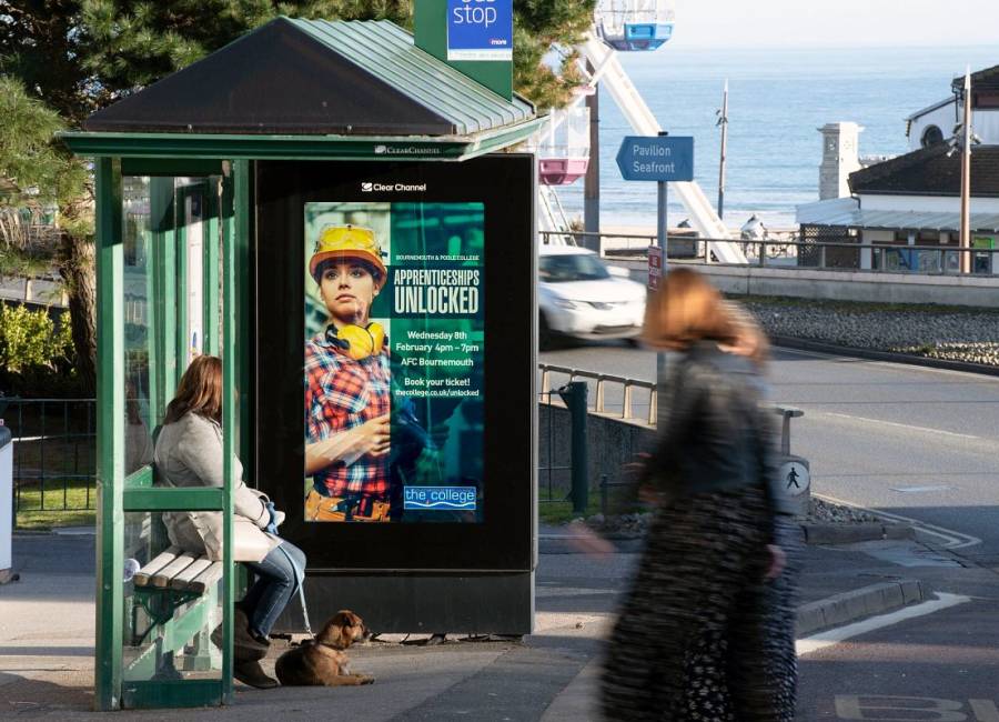
Bournemouth & Poole College used Adshel Live, the UK’s largest Digital Out of Home network, to run a campaign advertising their apprenticeships open evening.
Due to the geographically limited nature of the target audience, the college focused solely on the wide range of DOOH screens covering key locations across the two towns. Bus shelter advertising was also utilised, as buses are a popular method of transport amongst the target demographic.
The creative very simply depicts a woman in a carpenter’s outfit, which is clever for two reasons. Firstly, adverts that show human faces often capture attention and provoke stronger reactions than those that don’t.
Secondly, the decision to show a female carpenter is modern and avoids gender stereotyping. This makes the courses seem accessible, preventing certain audience groups from ruling themselves out. This theme is continued with the use of the word ‘unlocked’, which also connotes accessibility.
By opting to provide specific details and a URL CTA, passers-by are given all of the information that they need to enter the next stage of the customer journey there and then. The audience can be activated immediately, lessening the chances of people walking away and forgetting about what they’ve seen.

Uber Eats: Iftar Incoming
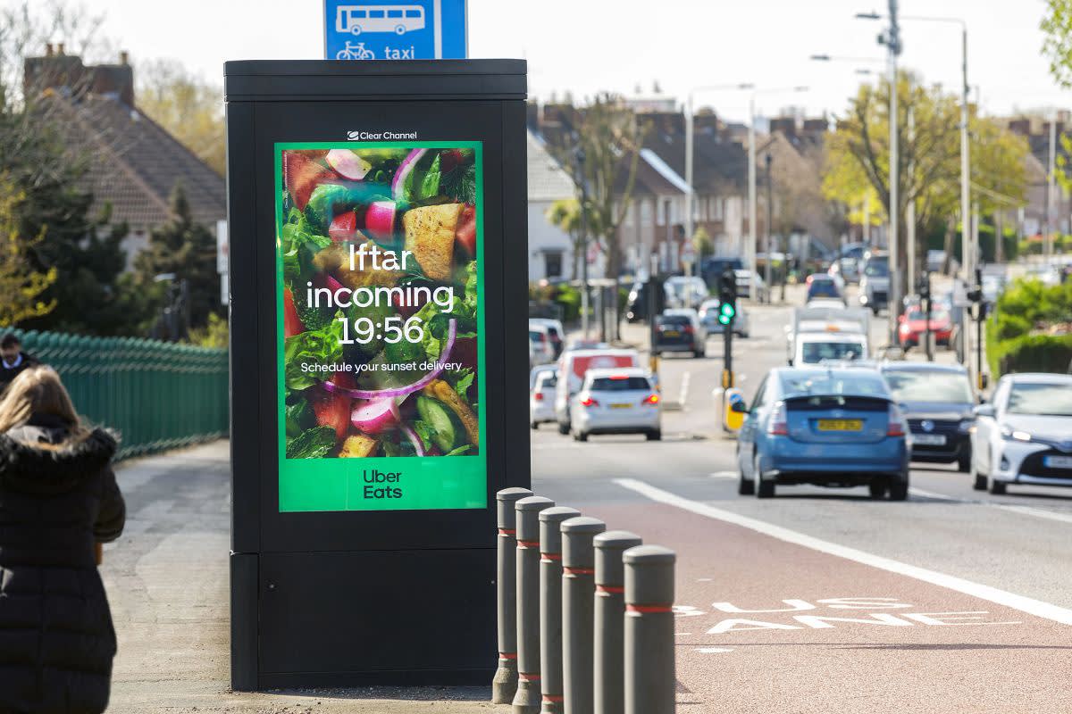
The final spot on our list of incredible DOOH examples goes to Uber Eats. The company ran a dynamic campaign across various UK cities during the holy month of Ramadan, personalising the context to suit the local Muslim community.
During Ramadan, Muslims can only eat when the sun is down. This means that Iftar, the fast-breaking evening meal, begins at different times depending on location and date.
Uber Eats had the creative idea of displaying the local Iftar time in different cities, activating customers to schedule a meal to arrive at sunset. The message is practical, helpful and considerate, forging a connection with the intended audience.
The background image features a variety of signature Iftar dishes available to order on the platform – another great example of an audience-centric strategy.
Engage audiences with DOOH
From businesses to charities to educational facilities, these Digital Out of Home advertising examples have hopefully left you feeling inspired and ready to build out your own campaign.
To find out more about how DOOH can help your brand to engage audiences and increase revenue, please get in touch for a no-obligation chat.
Start your DOOH campaign
Interested in learning more about DOOH advertising? Fill in our form and one of our team will be in contact shortly to answer your questions and get started on your next campaign.


