Digital Out of Home advertising is a powerful way for brands to connect with audiences in a real-world environment. It offers unparalleled reach, with almost 38 million people coming into contact with DOOH screens every week.
But there’s a big difference between simply seeing an advert and having it genuinely resonate. To engage audiences and leave a lasting impression that incites action, it all comes down to the creative.
That’s why it’s so important to understand the DOOH specs that you’re working with and the medium’s creative best practices. So, let’s get to it.

DOOH specs
Before delving into what makes a creative visually effective, it makes sense to briefly cover the different Digital Out of Home formats and their relative specifications. To design a creative that works intuitively within the screen it’s displayed on, you need to understand the varying sizes and technical specs.
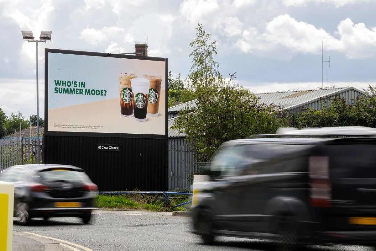
DOOH screens are usually around the same size as their static counterparts but require different specs, due to the content being uploaded digitally rather than printed. For example, Billboard Live, our digital 48-sheets, requires an 864px x 432px creative in a JPG format.

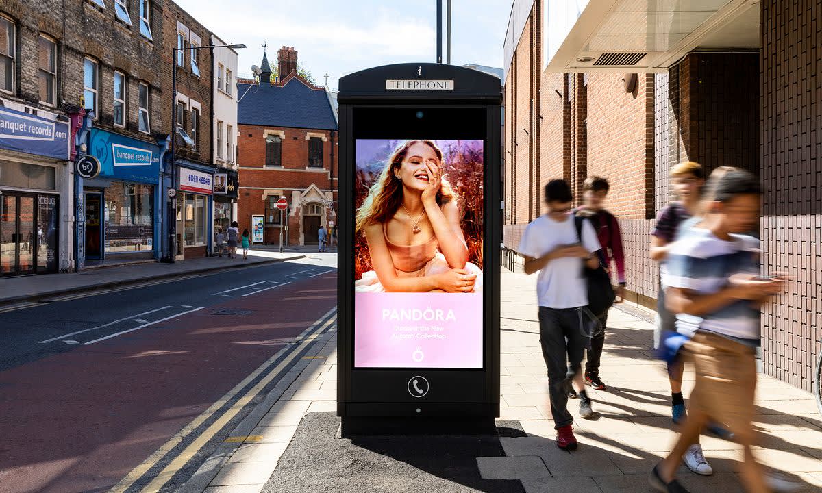
If you’re advertising on a portrait 6-sheet like our Adshel Live, this changes to 1080px x 1920px. These digital panels can be viewed up close, where every detail is visible. That’s why they require a higher resolution than digital billboards, which are usually elevated.
Brands utilising dynamic and interactive content will be provided with more detailed specs after consulting on the elements of their campaign.
Although it might be tempting to repurpose creatives that have already been designed for other channels, this is not advisable. To truly get the most out of DOOH, advertisers should leverage its unique creative capabilities and design purpose-made content that’s tailored to the format.
What makes an effective DOOH creative?
Now, for the fun part – the creative design. There are always exceptions to the rule, but these are the general best practices for designing an effective DOOH creative.
1. Simple messaging
Whatever copy you use should be kept short and to the point. People are often in motion as they pass DOOH displays, so the words need to be easy to take in while still compelling enough to incite an emotional reaction.
Wordplay and humour can be used to great effect, but don’t try to be too clever or complicated – if the message can’t be quickly and easily understood, you risk losing your audience.
2. Clear fonts
Legibility is key when choosing the fonts for your DOOH creative. Avoid overly decorative styles – serifs can be used but stick to basic fonts like Times New Roman.
Although trying to stand out from the crowd is an appealing idea, using an unusual font can be jarring and have the effect of discrediting a brand. Instead, the use of colour and motion is what really grabs attention.
3. Contrasting colours
Bold, contrasting colours create a high level of impact and will draw attention in almost any environment. Talented designers will be able to do the same thing with complementary colours, but this can be harder to get right.
Alternatively, minimalist white and black is timeless and effective. The universal colour combination of words on paper adds a touch of familiarity, welcoming the viewer to look at it.
4. Less is more
You might want to pack everything great about your product into your ad but be wary – visual noise is not appealing. If a creative looks cluttered and unfocused, those sentiments are reflected onto the brand. Instead, keep the attention focused on one thing at a time and you’ll create a compelling visual journey.
5. Make it interactive
It’s no surprise that interactive content is both more engaging and memorable than your average static poster. With interactive features, brands can showcase their creativity, open up two-way communication and bring a little fun to their audience’s day.
6. Keep it contextual
Utilise dynamic messaging to deliver information relevant to the environment, location or a current event. Contextually relevant content helps to establish a strong connection with the audience, increasing ad effectiveness by 17%.
7. Pay attention to positioning
Your design might look great on screen but will it have the same impact in real life? How the creative looks in situ is crucial to campaign success, so consider factors such as lighting, height and any external elements that could be competing for attention.
Get in touch
Following these DOOH creative best practices will help you to create visually striking and professional campaigns that drive further brand interaction. Applying them through the lens of your audience’s needs will take the finished product to the next level.
To discuss the creative possibilities of DOOH or find out more about specifications, please get in touch with our helpful team.
Start your DOOH campaign today
Interested in learning more about DOOH advertising? Fill in our form and one of our team will be in contact shortly to answer your questions and get started on your next campaign.


