The Do's and Don'ts of Bus Stop Advertising
16 Nov 2021 / Insights.jpg)
Bus stop advertising is one of the most effective forms of OOH advertising, reaching 98% of the UK population at least once a week. This powerful format engages both commuters and pedestrians throughout their daily journeys, making it a prime choice for brands seeking high visibility.
Whether you’re a small business or a major brand, bus stop advertising offers powerful exposure and drives real results. With its strategic placement and high-frequency visibility, it remains a cost-effective and impactful part of any digital Out of Home advertising strategy.
But what if you want to make a bus stop advert and don't know where to start? Not to worry—by learning a few simple do's and don'ts of bus stop advertising, you'll be ready to market your business in no time at all.
Ready to create a great bus stop advert? Read our top do's and don'ts below.
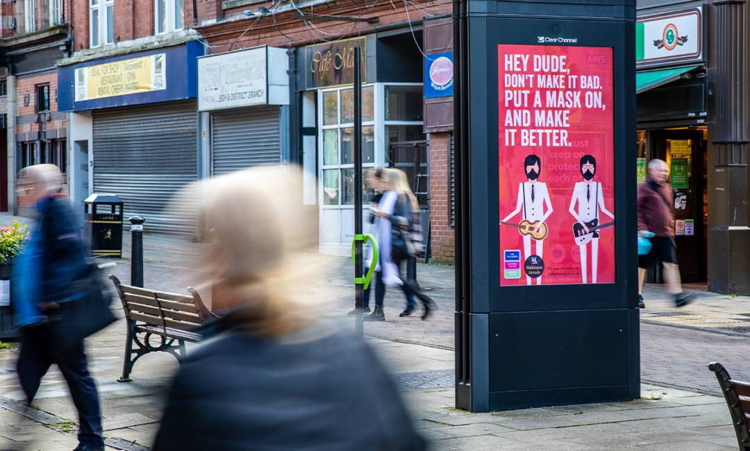
Do: Use Eye-Catching Colours
Although people will most likely be waiting at the bus stop where you place your advert, you still want to make it eye-catching. Passengers tend to be on their mobiles while waiting for the bus, so you need eye-catching colours to direct their attention to your advert.
Some examples of eye-catching colours include red, orange, and yellow. Even if your advert is black and white, consider adding a pop of colour for contrast and added visual interest.
If you've ever looked into colour psychology, you'll know that colour plays a huge role in subconscious marketing, so be mindful when choosing your colours.
Don't: Make It Difficult To Read
Although you may want to use an interesting, cursive font, it's not a good choice for outdoor advertising.
Instead, use a font that's bold and easy to read both close up and from far away. You can use cursive font for small accents on your advert if it fits, or use them on your website and other promotional materials such as business cards.
Besides font, your advert might be difficult to read if you put too much text on it, so be mindful of the ratio of text and images that you use.
Do: Look at Inspiration
If you're not sure of what to include in your advert, definitely take a look at inspiration from companies in your niche.
Advert inspiration helps you in two ways. First of all, it helps you to see what other businesses in your niche are doing. For example, if you're a beauty company, you might notice that other beauty companies don't put a lot of makeup on their models to emphasize clear skin.
The second way that advert inspiration helps you is that it lets you stand out from your competition. Once you're aware of how other companies in your niche are advertising, you can figure out how you can make your adverts different.
Don't: Copy Others
If you copy others, not only do you not stand out, but you lose the trust of your audience.
Instead of copying others, think about what you like about another company's advert. Is it their clever play on words? Or the feeling of serenity that the clean lines and simple colours give the viewer?
Take note of the things you like and figure out how you can apply them to your own brand. This way, you're incorporating clever elements into your design without copying others.
Do: Think About Placement
No matter how good your photography is, your images need to be placed on your advert so that they stand out but aren't distracting.
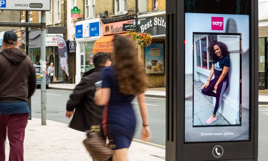
For example, if your company is a dentistry office, you'll want an image of a smiling person with healthy, sparkling teeth to be the focal point of your image.
Placement also includes where you place your advert. Is it near a rapid transit station with lots of commuters? Conduct some research to find out where your customers usually are so that you can expose your advert to more people in your target market.
Don't: Use Small or Low-Resolution Images
Even if an image looks good on your computer screen, this doesn't mean it will look good on your bus advert.
Make sure to get a mockup printed that's the same size as your advert will be. This way, you can fix any issues that arise with resolution.
To avoid this problem from the start, make sure you use the highest resolution images possible. You can always re-size them later if they're too big.
Do: Get the Point Across Quickly
Your advert is going to be seen by commuters waiting at the bus stop as well as by pedestrians and maybe drivers. You need to get the point of your advert across quickly so that you can expose your brand to as many groups of people as possible.
Attention is especially important if you're doing any kind of roadside ads, as they'll be seen by people who are walking or driving by.
When designing your advert, think about how the fonts, images, colours, and placement all work together to get your brand philosophy and message across.
If you're having trouble figuring out how to design your advert, take a look at some graphic design basics to give you a head start.
Don't: Go Off-Brand
Finally, no matter how many pieces of advice you read, make sure that you don't go off-brand just to follow trends or try to do what everyone else is doing.
Imagine if a potential customer sees a bright yellow and black advert for your yoga studio, which you made because you wanted the advert to pop. Then, the person goes to your website only to see soothing whites and mint greens.
In this case, the potential customer might get confused or might think they've gone to the wrong website. This is why you need to stay consistent with your branding materials across all platforms.
Ready To Get Started With Bus Stop Advertising?
Outdoor advertising is one of the best ways to help your business reach more people.
And each one of these new people you reach could become a loyal new customer for your business.
We hope this article helped you get started with bus stop advertising. If you'd like to create an outdoor advert but still aren't sure where to start, Clear Channel can help.
With more than a dozen offices across the UK, our advertising experts can help you reach more of the right people, whether that's locally or nationally. Contact us today to get started.
SHARE POST
PRESS ENQUIRIES


