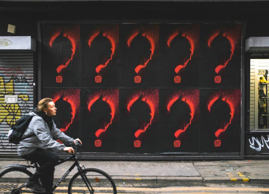
A fantastic use of intrigue by incorporating the film trailer QR code into the question mark design.
*image from Warner Brothers / JACK

Isn’t it just great to have such a packed film slate back? And with it, the rumours, the hype, the gossip, the reviews – and of course – movie marketing.
Opinion by: Ben Hope, Marketing Director
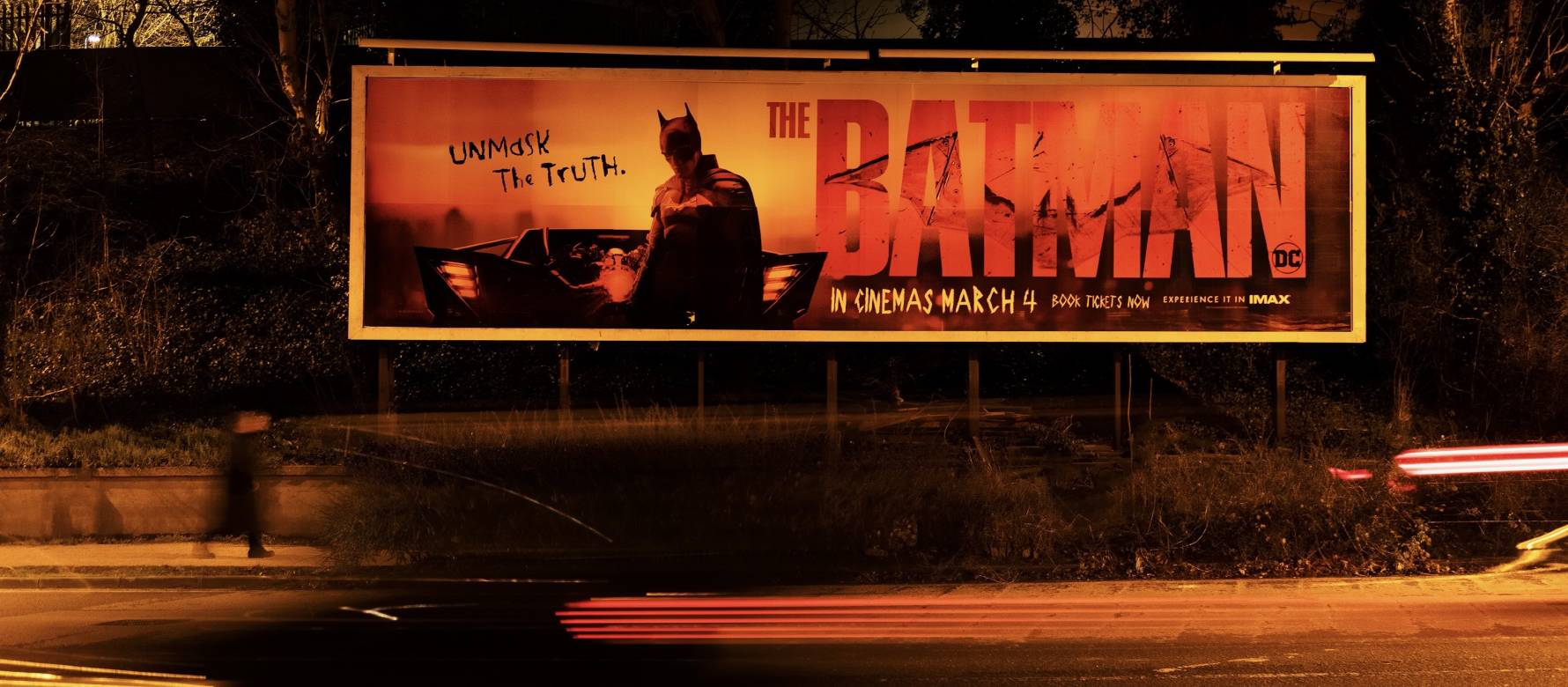
As we saw with Bond last year, outdoor advertising plays a huge role in driving awareness of a new film release. And it’s why I’m excited to not be able to move right now without seeing posters in all shapes, sizes and formats for The Batman. It’s my selection for this month's Powerful Poster highlight.
So, what do I like about it?
For me, it’s a mix of the different objective-based designs across each Out of Home format that’s winning the day, but all making brilliant use of our dark, masked hero.
Large-format billboards with a striking, eye-catching design pushing awareness. Copy expanded almost to the bleed in making sure it’s unmissable, with a succinct amount of information being communicated.
Adshel Live ‘teaser’ posters. Beautifully simple, intriguing, monochrome imagery which boldly outlines the hero in a question mark. Attention grabbing during the day, and like the hero, almost menacing at night. The launch date also being the highest contrast element, which provides additional payoff to hit marketing objectives, and the final stand-out communication across the sensible Z-flow of the poster.
The use of subtle motion to bring the above creative to life in pedestrian areas, making a more eye-catching execution. and;
Finally, I’m a huge fan of how Warner Brothers have integrated a QR code only into the classic, fly-posted design. Thinking of a good customer experience as part of the campaign which promotes the hotly anticipated and hugely viewed trailer.
Bonus: If you've not seen what Grand Visual have done for the movie on the Burj Khalifa - it's an absolute DELIGHT. See here.
I can’t wait to see the film, and no Joker (sorry!), I only hope it’s as unmissable as the outdoor campaign.

A fantastic use of intrigue by incorporating the film trailer QR code into the question mark design.
*image from Warner Brothers / JACK
The designs within this campaign certainly hit the core ideas of being simple, striking, succinct and sensible. If you're interested in finding out more about how to design for outdoor, and more from our series of Powerful Posters and mastering outdoor creativity - check out our Powerful Posters roundtable.
SHARE POST
PRESS ENQUIRIES