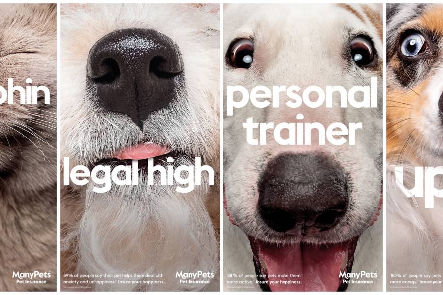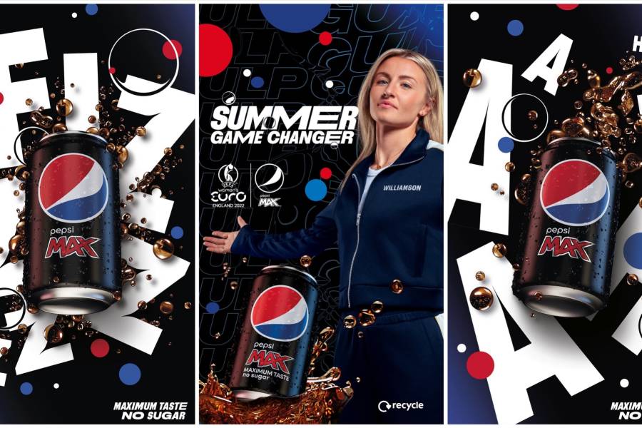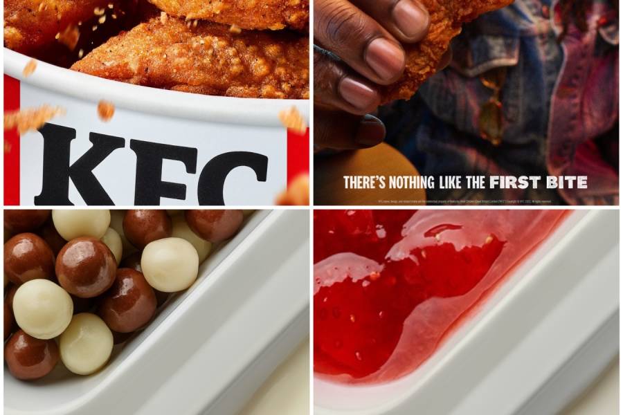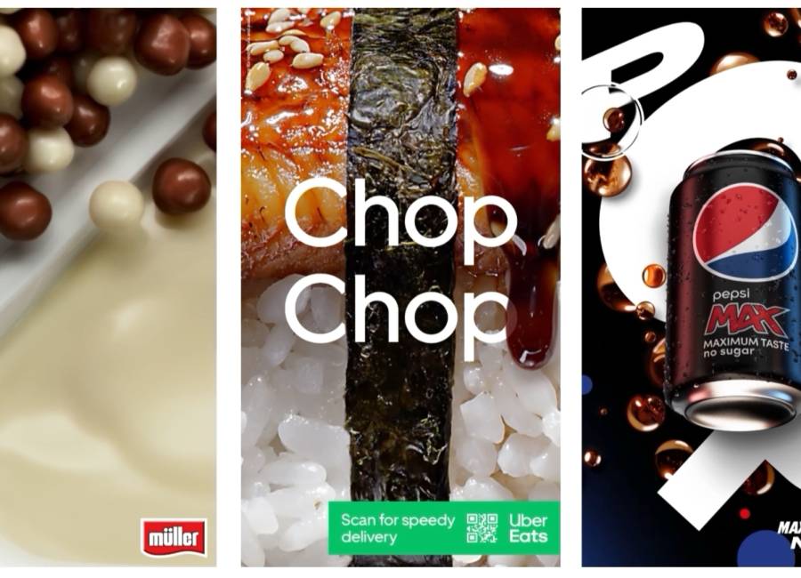
A summer design trend that we’re noticing plays right into the hands of those looking to craft Powerful Posters for outdoor advertising – and that’s being larger than life. Below, I’ve highlighted a sample of campaigns that are using beautiful hero imagery, blown up large, alongside simple branding and bold typography to let the product (or pets) do the talking.
1. A big emotional pull.
Using consumer insight, ManyPets is encouraging pet owners to ensure their happiness with a striking set of hyper close-up, ultra-cute photographs of furry family friends. A sure-fire way to attract attention from their target audience.

2. Hearing what you’re seeing.
Pepsi’s latest campaign combines bold typography (forced me to step back into my GCSE English somewhere back there!) , onomatopoeia copy and a larger-than-life pack shot providing the thirst during the recent summer heatwave. Hearing is believing.

3. Driving desire.
When your product is simply delicious, sometimes all you need to do is simply show it. But show it large. Enough said. Let the power of the product and your brand do the rest. Bravo, KFC and Müller.

4. Prompting response with clever copy.
Grabbing the attention of busy on-the-go commuters is no easy task, but the power of clever copy overlaid on relevant, extra-large imagery with a quick access QR code could do just the trick for Uber Eats.

5. Move your audience with moving creatives.
I've also seen a few of these campaigns have enhanced their close-up creatives with a simple addition of subtle motion for extra eye-catching appeal. Delightful stuff.

SHARE POST
PRESS ENQUIRIES


